


When the web was young, building layouts meant painstakingly wrestling with floats, clears, browser quirks, “reset” files, and vendor prefixes. CSS itself underwent major evolution (from CSS1 → CSS2 → modular “CSS3” specifications) to catch up.
Early attempts to simplify layout included CSS resets—e.g. Eric Meyer’s reset.css (2007)—to normalize browser defaults and avoid cross-browser inconsistencies.
Then came true CSS frameworks: toolkits that bundled a grid system, base styles for typography, and helper classes. Think Blueprint, 960 Grid System, and early layout libraries.
As front-end tooling matured (preprocessors like Sass, build chains, better dev tools), frameworks evolved too. They went from “grid + base styles” to component libraries, utility-first systems, themeable systems, and hybrid models. In parallel, JavaScript frameworks (React, Vue, etc.) rose, and CSS-in-JS also emerged.
By 2025, it’s no longer just about “which CSS framework” but about which paradigm (utility-first, component-based, hybrid, minimal) matches your project requirements.
When I say “most popular,” I mean frameworks that:
- have strong adoption in real-world projects
- show up in developer surveys, usage stats, or framework directories
- have active maintenance, community support, and ecosystem (plugins, themes)
Note that “popularity” doesn’t always equal “best for your project.” A niche but elegant solution may be better suited depending on constraints.
Also note usage statistics: W3Techs tracks broad CSS framework adoption, and their usage graphs show Bootstrap as the dominant CSS framework among those with >1% adoption.
With that in mind, here are CSS frameworks you should be aware of in 2025 (in no strict ranked order, but roughly from broad to more specialized).
Bootstrap
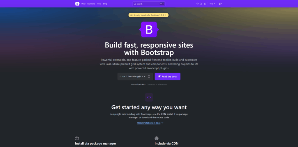
Bootstrap remains a stalwart. Originally created within Twitter to unify internal UI tools, it was open-sourced in 2011.
It bundles:
- a responsive grid system
- UI components (buttons, modals, navbars, cards, forms)
- utility classes
- JavaScript modules (vanilla, no jQuery dependency in newer versions)
Here’s a very simple Bootstrap 5 button:
<button class="btn btn-primary">Click me</button>Because Bootstrap has decades of ecosystem, themes, and community knowledge, it’s often a safe default. But in 2025, many developers prefer lighter or more utility-oriented frameworks for finer control.
Tailwind CSS
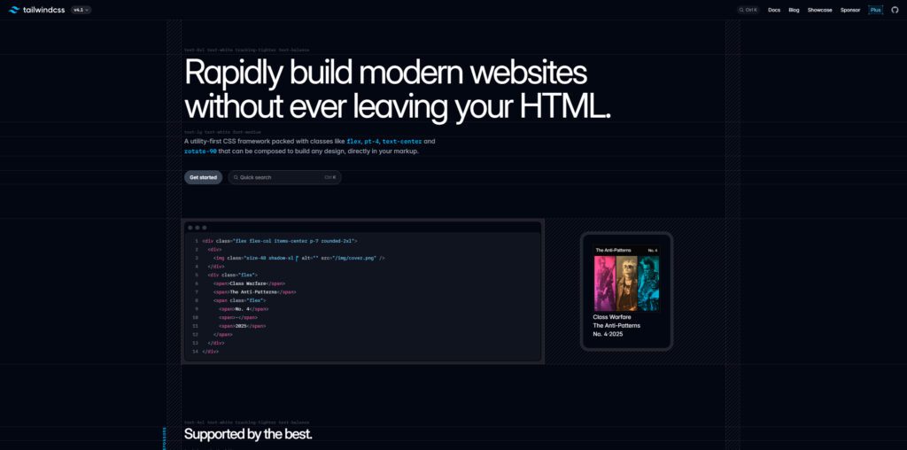
Tailwind arguably defines the “utility-first” wave. It ditched the idea of semantic component classes (like .btn-primary) in favor of super granular utilities (bg-blue-500, px-4, etc.).
Key features:
- its Just-In-Time (JIT) mode generates only the CSS classes you use, keeping bundle size manageable
- strong theming configuration (colors, spacing, breakpoints)
- seamless integration with component-based frameworks (React, Vue, etc.)
- wide plugin ecosystem
Example:
<div class="p-6 bg-white shadow-md rounded-lg">
  <h2 class="text-xl font-semibold mb-2">Hello Tailwind</h2>
  <p class="text-gray-600">This is a simple card.</p>
</div>Many in dev communities now see Tailwind as the default “modern” CSS framework.
Bulma
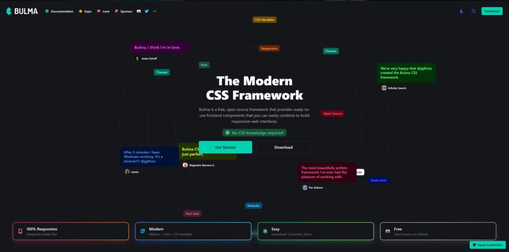
Bulma rides the middle ground. It’s a pure CSS framework (no built-in JavaScript), built on Flexbox.
Bulma offers:
- semantic component classes (e.g.
.button,.navbar) - responsive layout and columns
- modular imports (so you don’t need the whole library)
- customization via Sass variables
Bulma is often chosen when you want an easy-to-read semantic class API, without adding JS overhead.
Foundation (by ZURB)
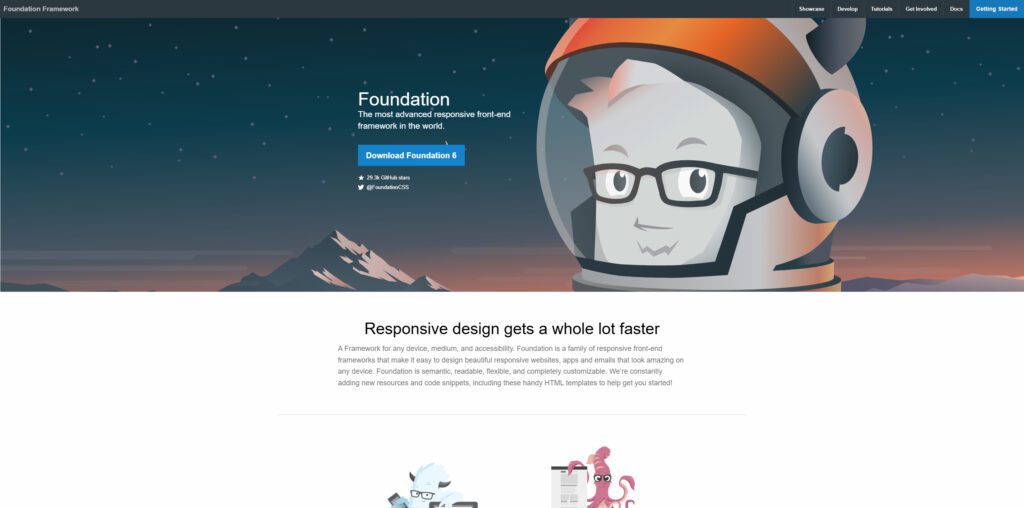
Foundation is long standing and historically more sophisticated (or opinionated) than Bootstrap.
It provides:
- grid and layout tools
- UI components
- accessibility-first design
- mixins and advanced Sass support
It’s a heavier option, but when you need more robust UI systems or design teams that expect “all features,” it’s still relevant.
Chakra UI
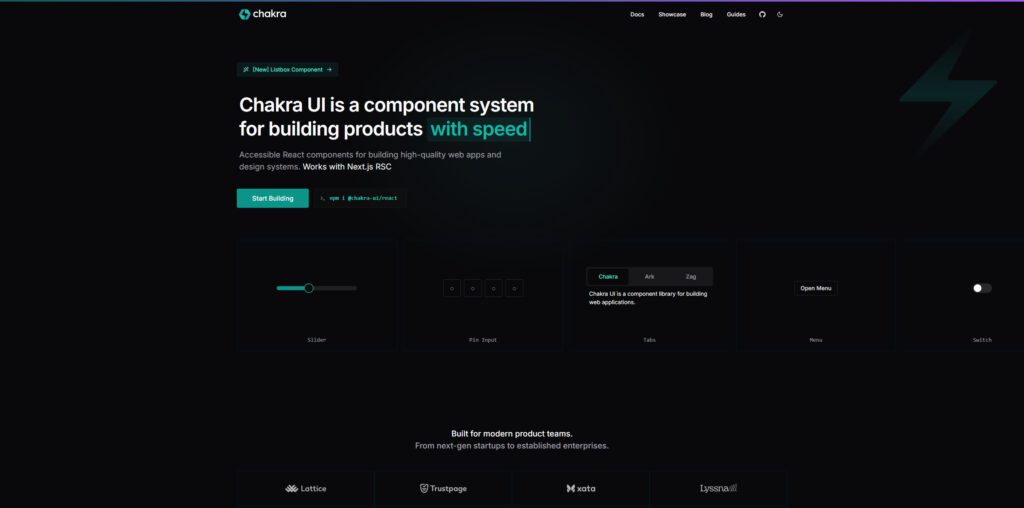
Chakra UI is more component-driven and often discussed in the context of React. It blurs the line between CSS framework and component library.
It offers:
- styled React components that accept style props
- dark mode support out-of-the-box
- theme-based design tokens
- focus on accessibility
You don’t typically write raw CSS—styles come through props on components—but for many people that’s convenience.
Materialize (Material Design)
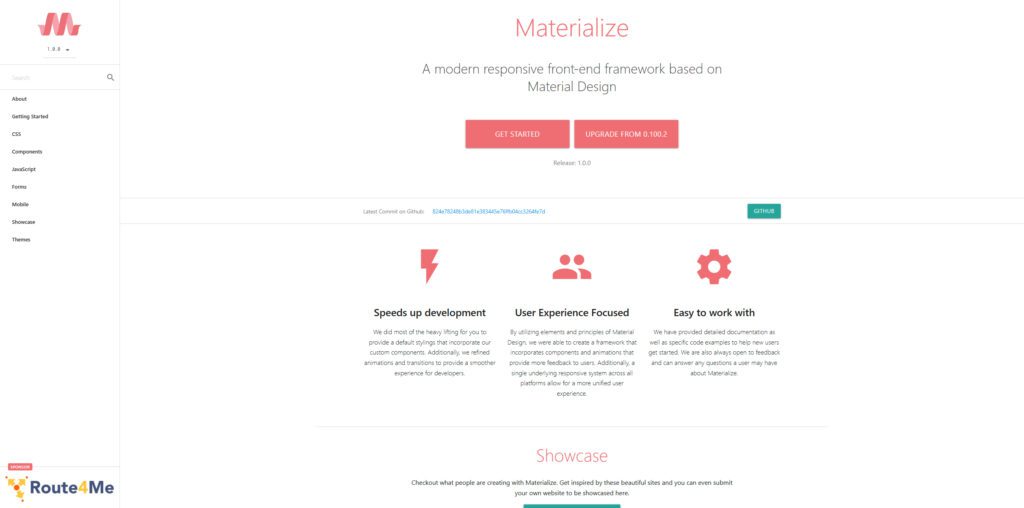
Materialize is based on Google’s Material Design principles. It provides visually consistent UI components.
You get cards, buttons, forms, navigation, animations, etc., styled to Material specs.
One downside: Materialize tends to carry stylistic opinion (i.e. you see “Material look” naturally), so customization is more work.
UIkit

UIkit is lightweight, modular, and emphasizes small CSS + JS bundles.
It lets you include only what you need, e.g. just grid + icons + dropdowns, not entire UI library.
Good choice when you want flexibility, modularity, and avoid “bulk” in your CSS build.
Skeleton
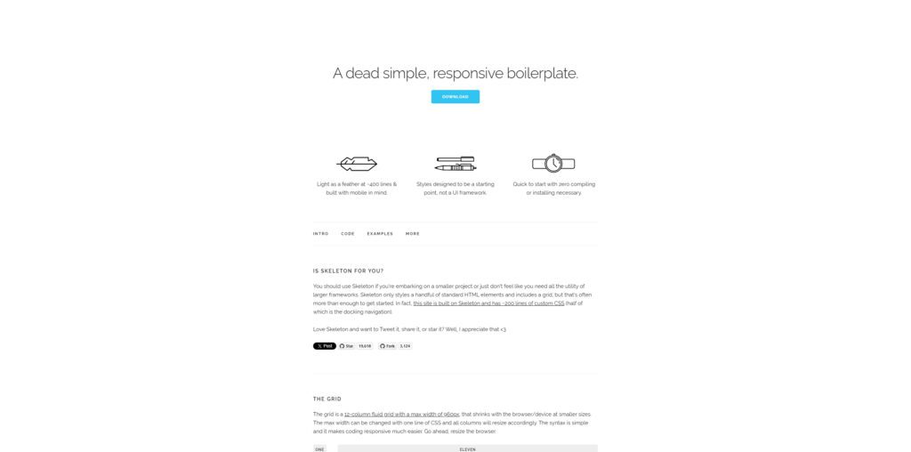
Skeleton is minimal — it’s more of a boilerplate than a full framework. It gives you a responsive grid, base styles, and minimal components.
It’s ideal when you want just enough infrastructure but want to build your own visual design from scratch.
Milligram
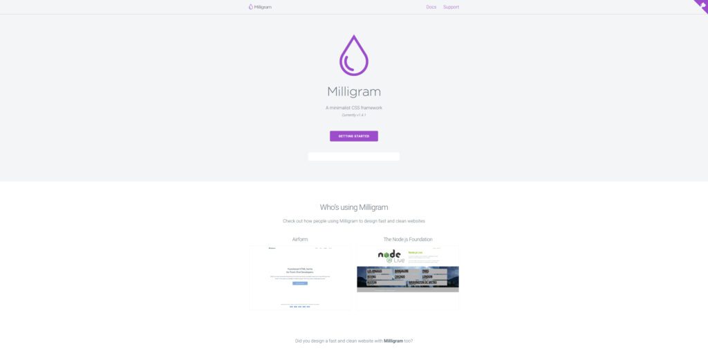
Milligram is another ultra-small framework (often < 2 KB gzipped) that gives you a minimalist base with sensible defaults.
Because of its light footprint, it’s used when performance and minimal CSS overhead matter.
Open Props / CSS Variable Frameworks
While not always called a “framework” in the traditional sense, low-level tools that provide CSS variables and utility mixins are rising. One example is Open Props, which gives you a base of design tokens, CSS variables, and some utilities.
These systems are useful when you want tight control, minimal overhead, and your own component wrapper on top.
Comparison Table (Selected Metrics)
Below is a table to help you see how some of these frameworks differ:
| Framework | Size / Weight | JS Dependencies | Approach Style | Best Use Case |
|---|---|---|---|---|
| Tailwind | moderate to small (JIT) | none (just CSS) | Utility-first | Projects needing custom UI quickly |
| Bootstrap | larger | JS modules (vanilla) | Component + utilities | Rapid prototyping, consistency, many plugins |
| Bulma | moderate | none | Semantic components | Clean UI without JS overhead |
| Foundation | larger | JS modules | Feature-rich component set | Complex UI systems |
| Chakra UI | depends on React bundle | React components | Prop-styled components | React ecosystems |
| Materialize | moderate | JS (for components) | Material Design opinionated | Google-style UI projects |
| UIkit | modular, can be small | JS optional modules | Modular component approach | You pick what you need |
| Skeleton | very small | none | Minimal base styles | Start-from-scratch small sites |
| Milligram | ultra small | none | Minimal styling base | Performance-critical, minimal overhead |
| Open Props | small | none | Design token / CSS var base | Custom UI systems built on top |
This table is a snapshot; real numbers depend on which modules you include, how you tree-shake, etc.
How to Choose — Questions to Ask Yourself
When selecting among these, ask:
- What level of control vs convenience do I need?
If you want pixel-perfect control, a utility-first or token-based system is better. If you prefer pre-built components, go with the heavier frameworks. - What’s the expected scale and complexity?
For small marketing sites, Skeleton or Milligram might suffice. For dashboards or apps, a component or utility library might make development faster. - What’s my tech stack?
If you use React, Chakra UI or integrating Tailwind into components is easy. If not, simpler CSS-only frameworks may be easier. - What’s my performance budget?
Consider how much CSS (and JS, if applicable) you’re willing to ship. A JIT utility framework or minimal base might be more performant. - Ecosystem & community support
A large community means better plugins, tools, and help when stuck. - Theming and customization
If you need to adhere to design system needs (brand tokens, dark mode), pick something with built-in theming capabilities.
Some Pitfalls & Trends (2025 Edition)
- Class name verbosity: Utility-heavy frameworks (like Tailwind) can lead to long HTML class strings. Some developers find that harder to read or maintain.
- Over-engineering: Including a massive framework but only using a fraction of it is wasteful. Always tree-shake unused CSS, or modularize your imports.
- Framework fatigue: Developers sometimes build “micro-frameworks” tailored to their project to avoid carrying unnecessary baggage.
- Disappearing frameworks: There is discussion about frameworks “disappearing” — meaning that frameworks should fade into abstraction so the developer only sees components or utilities, not heavy machinery.
- CSS evolving natively: New features in CSS (container queries,
:has(), CSS nesting) reduce the need for some framework abstractions over time. - Bundle size matters more than ever: In 2025, users expect fast, lean pages, and even CSS weight is a factor.
Final Thoughts & Recommendation
If I were advising a mid-sized web app in 2025, here’s where I’d lean:
- Start with Tailwind CSS for its balance of control, performance, and community.
- Use Chakra UI or a component-based framework if working heavily in React and wanting click-and-go components.
- Keep Bootstrap or Foundation in your toolbox for quick prototyping or classic web projects where consistency matters.
- Use lighter frameworks (Skeleton, Milligram, Open Props) for landing pages or minimal sites.
Whatever you pick, treat the framework as a tool—not a constraint. You should be able to override, prune, sculpt it to your needs.


